Wednesday, November 16, 2011
As a new homeowner or someone looking for a new home project, painting and decorating can be fun but frustrating when trying to decide on the colors and schemes to use. Knowing the basics about colors and using the color wheel can help the process.
There are three primary colors: red, yellow and blue. From the combinations of these three colors, the secondary colors, orange, green and purple, are made.
The actual color achieved depends on the proportions and specific color used. Mixing secondary and primary colors or mixing the three primaries creates tertiary or intermediate colors. These colors are yellow-green, yellow-orange, red-purple, red-orange, blue-purple and blue-green.
Usually, home designers want a harmonious color scheme. Too much of the primary colors can be too intense and even cause anxiety, aggression or give a perception of coldness. Using complementary or analogous color schemes can create a good balance of colors that are pleasing to the eye. Complementary colors oppose each other on the color wheel. Yellow and purple are complementary or opposite of each other. Analogous colors are next to each other on the color wheel. Blue, blue-violet and violet are next to each other, which means they have the same base color.
Other groups that are helpful to know about are warm, cool and neutral colors. Warm colors are red, yellow and orange. Cool colors are blue, green and violet. Neutrals are black, white and brown.
With these in mind, designers can make painting and décor decisions that won't result in a chaotic, unbalanced mess.
Whether it's a dramatic or simple approach, a good understanding of how colors are made and what complements what can help make choices that won't result in unhappiness and eventual money lost.
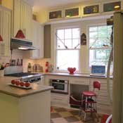
Keep in mind that a pop of warm color in a cool palette or vice versa isn't undoable. A cool or neutral palette with a bright, warm accent color still offers a balance that isn't completely boring.
You can still have creative color schemes with different shades and tints of colors that flow well.
Source: http://www.About.com.
Comments
Use the comment form below to begin a discussion about this content.
Sign in to comment
Or login with:
OpenID